
We've recently completed a fantastic redesign of the Cognition Cyclery website.
Project Brief
Cognition Cyclery is an awesome bicycle shop in Mountain View, CA. They asked us to re-imagine their web experience and we had such a great time doing it, we decided to share our journey here.
Building the New Cognition
Home Page
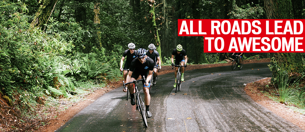
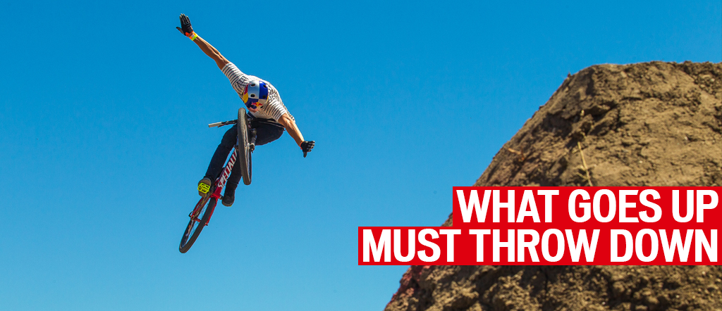
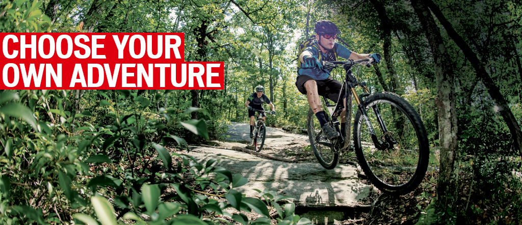
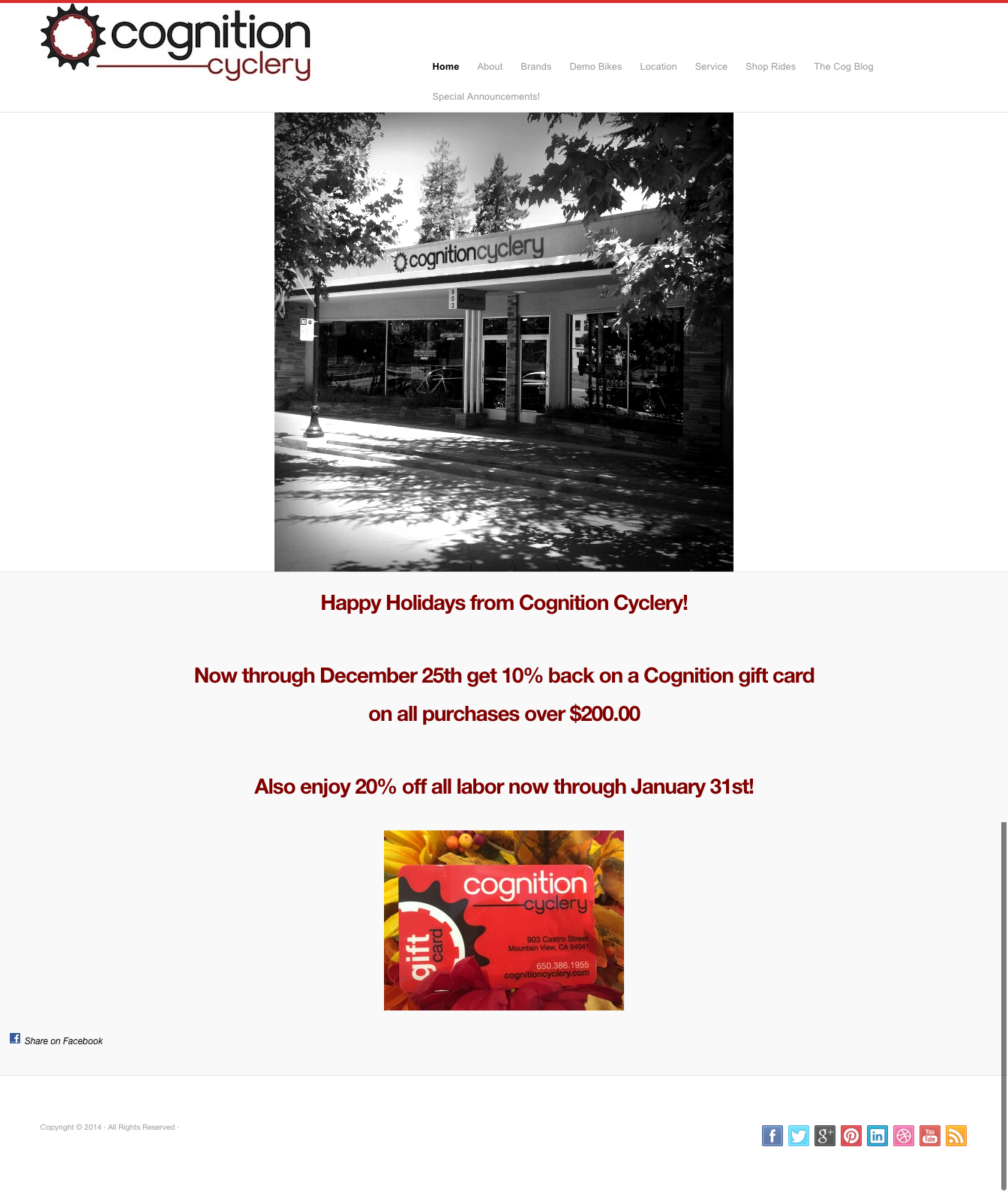
The new Home Page is markedly improved in color, format, and functionality. Users are welcomed to the site in an exciting, inspiring way that feels modern, professional, and inviting. The navigation has been simplified to create an intuitive navigation experience and a rotating banner image keeps the site interesting as users spend more time on it.
customized banner images
A few key features of the new home page:
- Logo is more central and vibrant colors are perfectly matched.
- Captivating "hero" image properly welcomes visitors.
- Clear mission statement describing scope of the site.
- Homepage has a useful, instructive visual hierarchy.
- Specially designed graphics direct users to special offers and guarantee pages
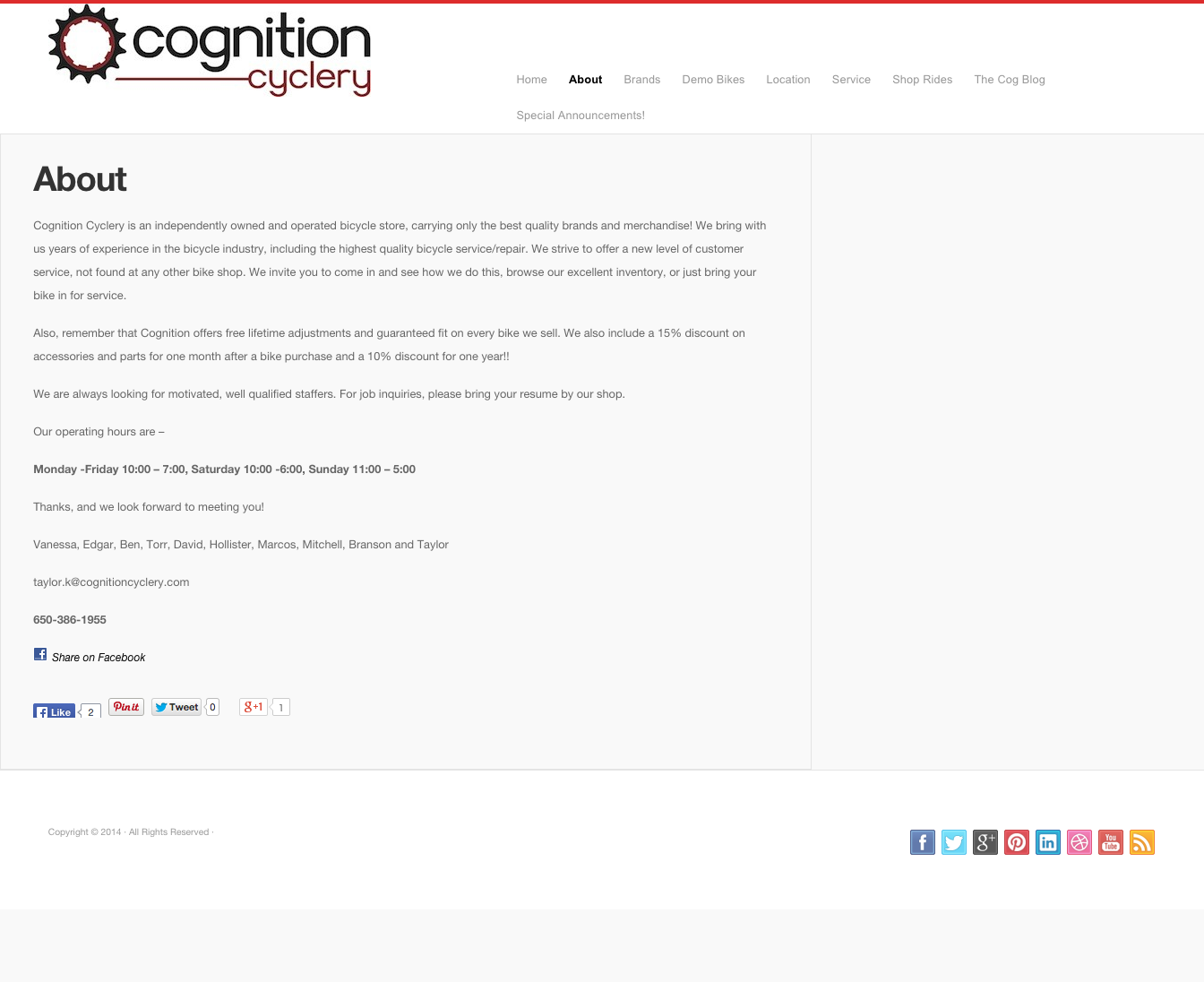
ABOUT PAGE
The about page blossomed into an informative, captivating window into the personalities and skill sets that turn the gears of the Cognition motor.
What's new on the About page:
- Circular, edited photograph shapes add motion and sleek page contour.
- Simple, direct language introduces staff members by name and position.
- Brief biography and fun bike-related staff trivia humanizes the site and adds familiarity.
- Professional, standardized photos reflect superior staff quality.
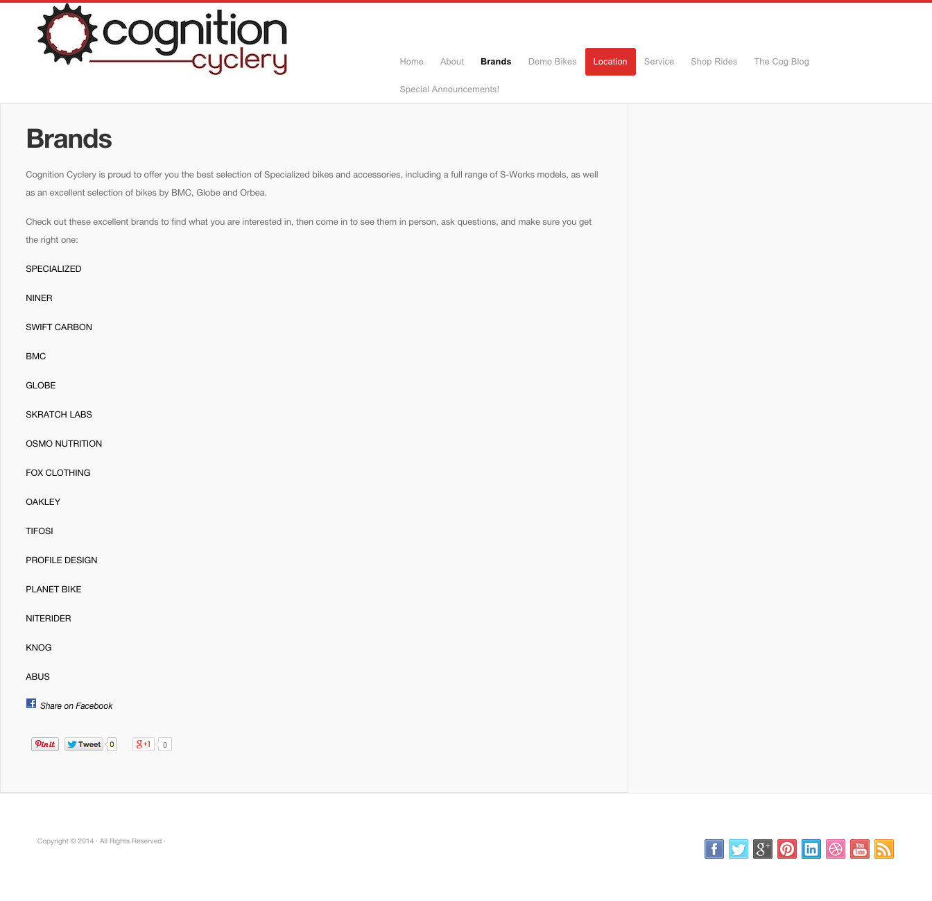
BRANDS PAGE
The brands page became far more dynamic than ever before, individual logos add both presence and professionalism to what was before simply a drab and unremarkable list.
Brand page updates:
- Brands have graphic, vibrant presence and are far more appealing.
- Logos and weighted layout add structure and impact to the site.
- Specialized logo receives prioritized placement highlighting Cognition as a Specialized-elite store.
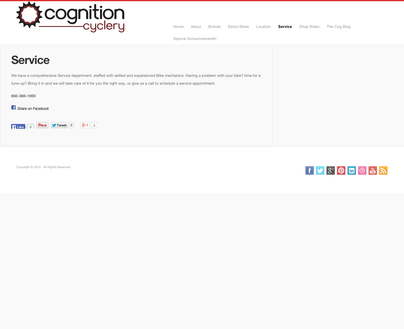
SERVICE PAGE
The service page attracts and motivates the visitor to explore the numerous opportunities Cognition provides to provide cutting-edge, professional maintenance and care.

Service page improvements:
- The page now includes an uncluttered, readable heading.
- Page provides a clear flow of information detailing service options.
- An attractive, informative banner urges users to explore.
BODY GEOMETRY FIT PAGE
The innovative Body Geometry Fit Page allows riders to obtain an amazing level of cycling customization, excelling at offering an unparalleled level of cycling refinement.
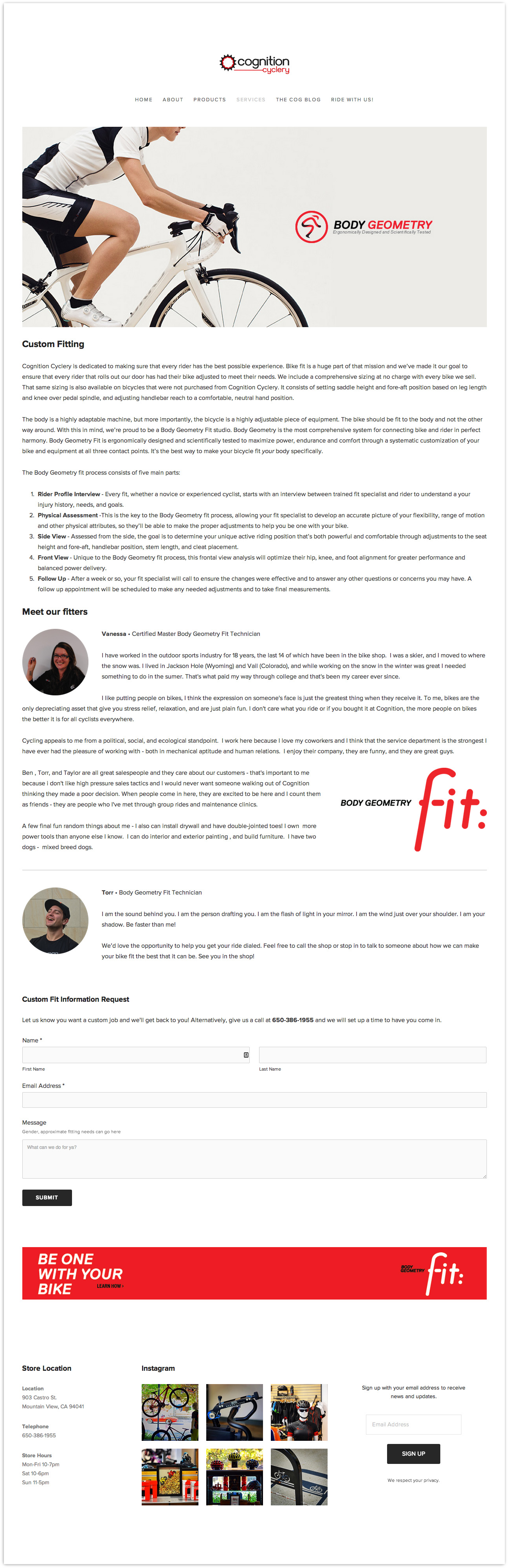
This is an entirely new addition to the Cognition site. Here are a few of its great features:
- Extensive information about the cutting-edge Body Geometry FIT program.
- In-depth profile with Cognition's head fitter for the program.
- Beautiful, inviting interface to draw the interest of page visitor in the program.
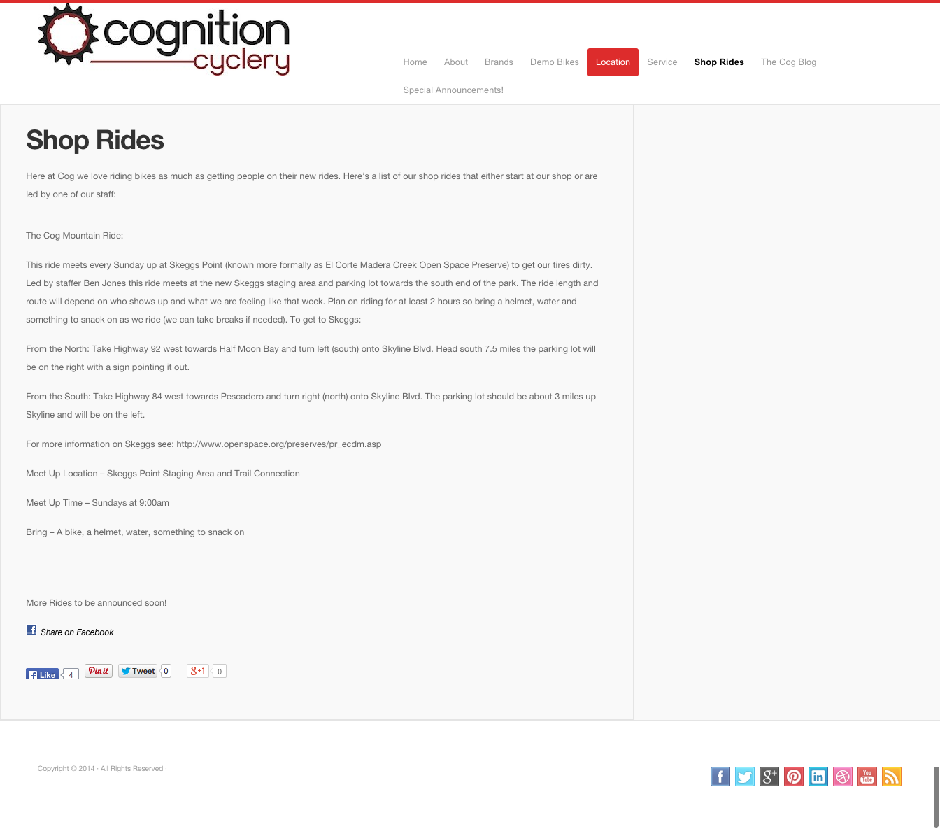
Shop Rides / 'Ride with us' PAGE
The shop rides page is more interactive , more accurate, and simply more engaging to the user than previously ever offered.
We retitled the "Rides" page to "Ride with Us" — the more inviting new page includes:
- Ride photos and media feature prominently to entice users to become involved.
- We interviewed Cognition's head fitter and prepared a detailed profile.
- A beautiful, inviting interface draws the interest of page visitors.
How we built it
CONTENT AUDIT
The first objective was to figure out what we wanted to keep from the current Cognition Cyclery site, and to have a way of sorting that out without being locked into a rigid content architecture. A simple spreadsheet did the job initially, but we also wanted to draw on our own ideas and best practices elsewhere on the web. A Google Sheet allowed us to see all the individual content items without locking them into their current design treatment or position in the site structure.
Listed all individual elements of the site that cannot be broken down into smaller chunks. The social media share links on Cognition's old website were a little overzealous:
We treated Facebook, Twitter, Instagram and the rest of the social media links shown on the original homepage below as individual content elements and made a decision with (shop owner) Taylor's input for each network about whether or not to keep the module on the site based on the ability of the shop employees and patrons to keep the various channels "flowing" and avoid the "empty dance floor" effect that can result from over-extending a business on social media.

We took notes on what elements we wanted to keep, new ideas to incorporate, and functions to add.
We then performed another content audit on another cyclery shop website to compare approaches and inspire new ideas for what we would like to do with the Cognition site. This time, we took notes, observed elements we liked and thought were successful to bring to the new Cognition site. We notated the features and aspects we most liked of the NorCal site to make sure they will be incorporated into the Cognition redesign.
CARD SORT
We created a hierarchical list of index cards, and then positioned them to give us an idea of how we wanted to proceed structurally. Here's what we ended up with:
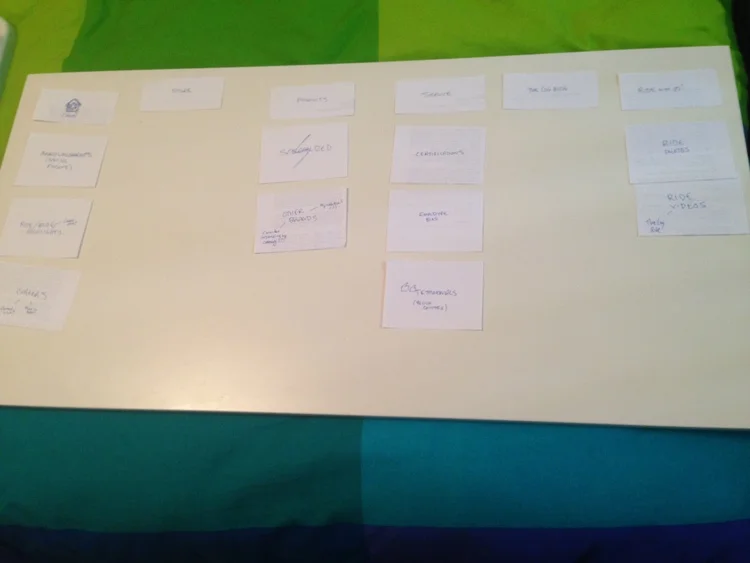
Then, we were able to systematically go through on a spreadsheet and decide what was contained on each link and each section of the existing site. The form and function of each section was considered, and the useful and helpful elements were marked to retain while the less desirable elements were marked for removal.
Then, we utilized Omnigraffle to generate the following content map:

Old Cognition Site Breakdown
HOME PAge
Many issues prevented the home screen from being effective and impactful.
- Two different shades of red were used on the logo and other elements.
- The existing picture was static and somewhat uninviting.
- There were no products on the homepage, nor suggestions about where to go next in browsing the site.
- Footer did not include information or contact links about how to get to the physical store, sign up for emails, etc.
- There was an excessive amount of social media sharing options.
- Mobile Navigation was difficult to use.
- There were two element rows comprising 9 items total, suggested navigation is optimized at no more than 7 per page.
ABOUT PAGE
The about page lacked detail and insight.
- Text wasn't concise and was too small to be read quickly.
- Shop hours were buried and not presented clearly.
- Further contact information lacked visual hierarchy, minimal staff information was impersonal.
- Right margin was unnecessarily tight on the page body content.
brands PAGE
The Cognition brands page suffered from a few visual difficulties:
- Brands lacked distinction and presence
- Bland, uniform typeface detracted from viewer attention.
- Blank space was not used effectively as it required more scrolling.
- The page contained no pictures or supplementary visual material of any kind.
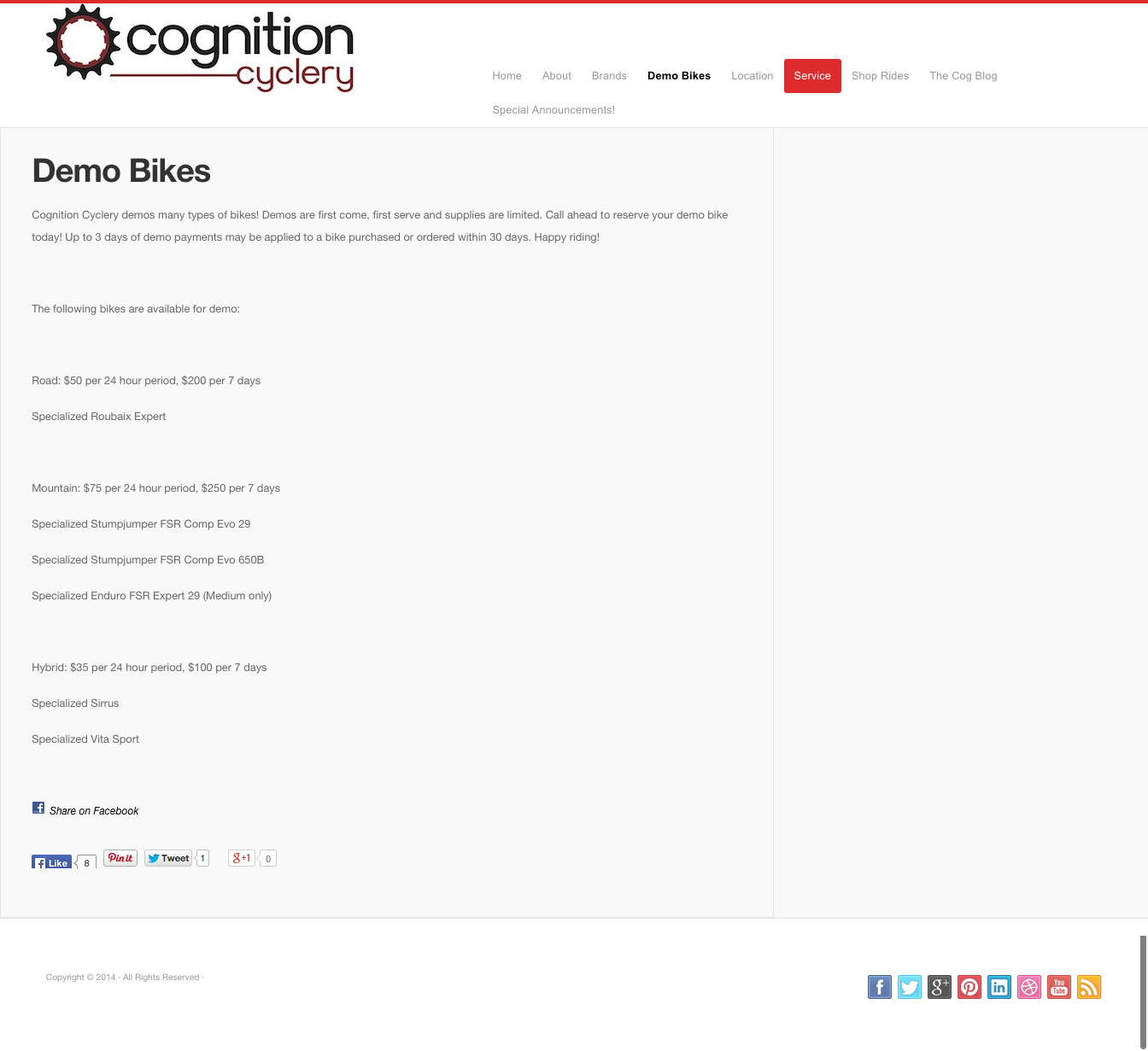
DEMO BIKES PAGE
The demo bikes had almost no "call-to-action" potential, and that was not motivational for any rider's interest.
- Price information was buried in a nondescript text block.
- There was minimal information about the bikes and no visual presence.
- The page gave an "empty dance floor" effect from minimal social media usage.
- Abundant whitespace on page created a lifeless atmosphere.
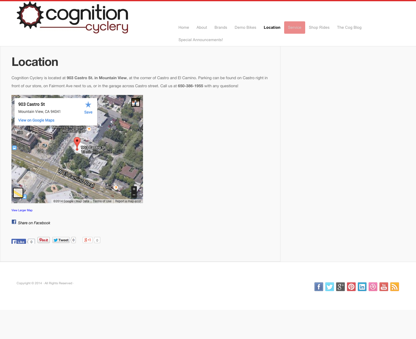
SHOP RIDES PAGE
The initial shop rides page had inconsistencies, errors, and lacked simple communication.
- Layout lacks direction and is too dense to read efficiently
- Shop ride information contains discrepancies.
- No map of any kind or visual tools for direction.
- No social media of any sort to promote rides is lacked in user engagement.
Project Outcome and Feedback
The results of the project were immediate, with the shop owner and staff overjoyed at the drastic improvements that will no doubt do wonders for the shop and its customers. I relished the chance to be an integral component of the team and the work from inception to finish. I collaborated closely with my brother, and my responsibilities included:
- Project management on a Kanban board, monitoring closely tasks to completion and adding new ones accordingly.
- Closely interfacing with shop and staff to achieve optimal communication about ideal site characteristics, and to collect pertinent site information and staff attributes.
- Generating content audit material and exercising discernment in making content-related creative decisions.
- Organization of site material from acquisition to placement, and consulting on visual layout and content hierarchical decisions.
- New content creation through interviews and surveys to add to the site.
This created a new website, where:
- Users are easily familiarized and not overwhelmed with site attributes on the landing page.
- Layout and site navigation is presented in an engaging, powerful way that simplifies the direction of the user.
- Visual presence and branding has blossomed from being almost nonexistent to flourishing in a new, exciting atmosphere.
- Site elements draw shop customers to want to make cycling and thus the shop's offerings a more prominent part of their lives.
The project was a smashing success, Cognition is thrilled with the outcome and we can't wait to undertake future projects that improve and enhance the experiences surrounding us.