Designing a careers portal that delivers a world class candidate experience and reflects the new eBay
The Problem
The old jobs page (below) did not put eBay's best foot forward: clunky navigation, colors used without visual impact and not tied to the eBay brand, outdated social sharing icons and other design details appear unprofessional and inconsistent with the style elsewhere on the family of eBay Inc. websites. The user experience created a sense that the page was not important to the company; it felt like it had been thrown together to satisfy a business requirement, without concern for the candidate experience as a potential applicant attempted to navigate through.
The old eBay Careers portal did not offer a good user experience for potential job applicants.
Researching the existing site experience from the perspective of a potential job applicant yielded several targets for the new UX. I observed a number of areas for improvement in the end-to-end new user registration and application flow.
- Branding and style of main pages inconsistent with the new eBay visual language.
- Browsing by job type is nearly impossible
- No support for connecting to LinkedIn, which has become the accepted standard for gathering employment history information
- Applicants are forced to manually enter their information into an ancient-looking web form, wasting time and weakening the impression of eBay as a cutting-edge company
- Distillation of all information into plain text fields without headers or styling (as available on LinkedIn) feels mechanical and deeply impersonal
- Lackluster form-field styling of candidate background and experience leaves users feeling like they are not presenting their information well
Deep frustration is probably the last thing a site designed to promote opportunities and positive thinking should induce.
The Solution
As a company invested in global business leadership, eBay inc. needs a careers site that delivers a world-class candidate experience, reflects the new eBay Inc. shared purpose and clearly demonstrates eBay’s brand position as an innovative, leading technology company. The new site will reflect eBay's deep focus on customers, people, and their experiences. It will be very clean & simple to use/navigate, effectively leverage the latest technologies to engage users, showcase the culture and why people should join eBay to work.
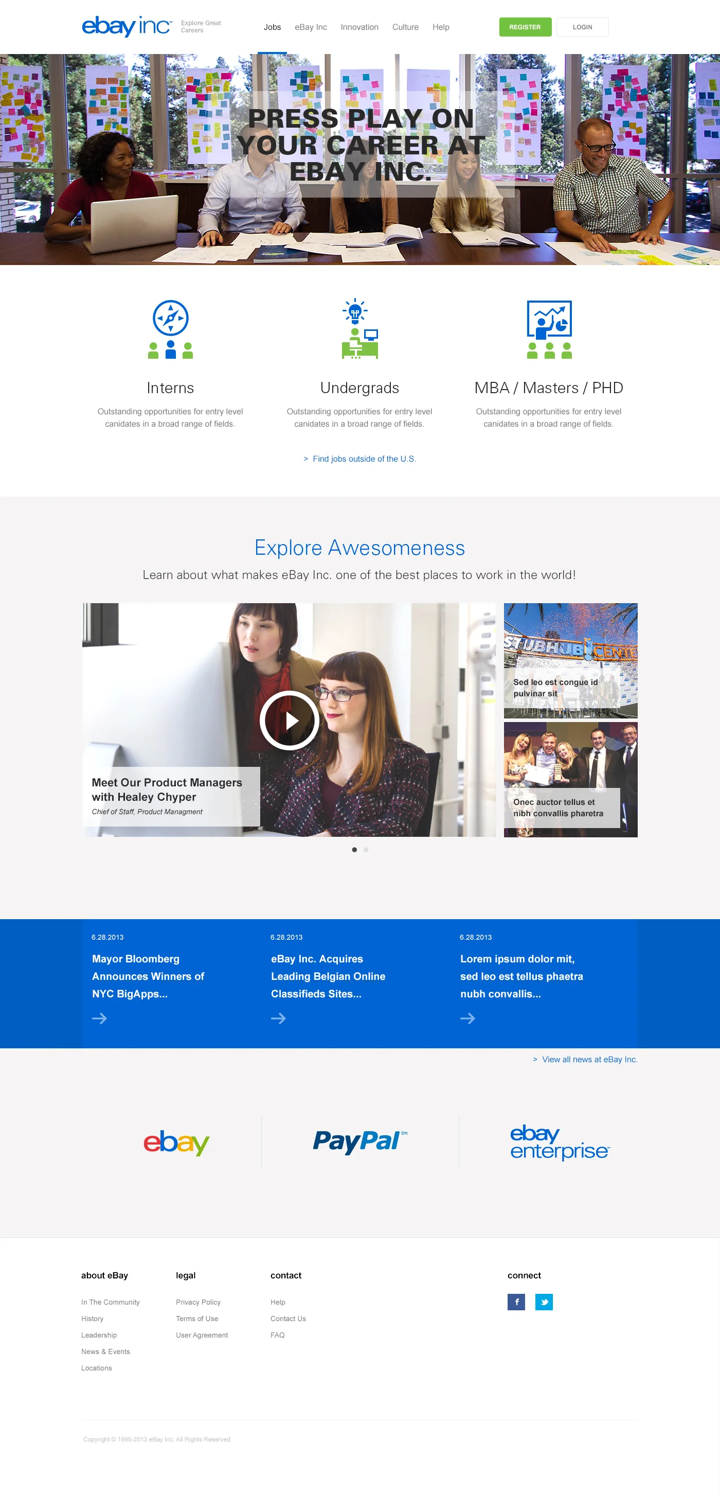
JOBS Page - Phase 1 Home Page
The new eBay Careers page required outstanding presentation of compelling content to ‘tell the story’ of eBay Inc as an employer. By translating some of the best practices in engaging one-page website design, we created a spacious, elegant and extremely professional layout.
New home page: Personal elements like employee stories mixed with a clean, balanced layout and immersive content styling immediately impress upon the user the value of the eBay Inc. brands
New user registration & application flow
The new registration system supports Connect With LinkedIn functionality and offers a dramatically smoother interaction. User information is nicely organized and styled attractively, so candidates feel they are representing themselves well in their application. This prototype demonstrates the simplified, intuitive flow from job details page to application confirmation (and suggested jobs) on the final page.

Login / Registration: I wanted logging in or registering for a new account to be simple and unobtrusive
Browse Jobs: Intern positions
Jobs are grouped into three primary levels, each containing sub-divisions by education level and a responsive grid of custom icons representative of the job type and consistent with the eBay colors and style. The Interns page is shown below, with sub-divisions for education level.
The Interns page includes jobs for Undergraduate, Masters, and PhD roles—as well as "A Day in the Life"
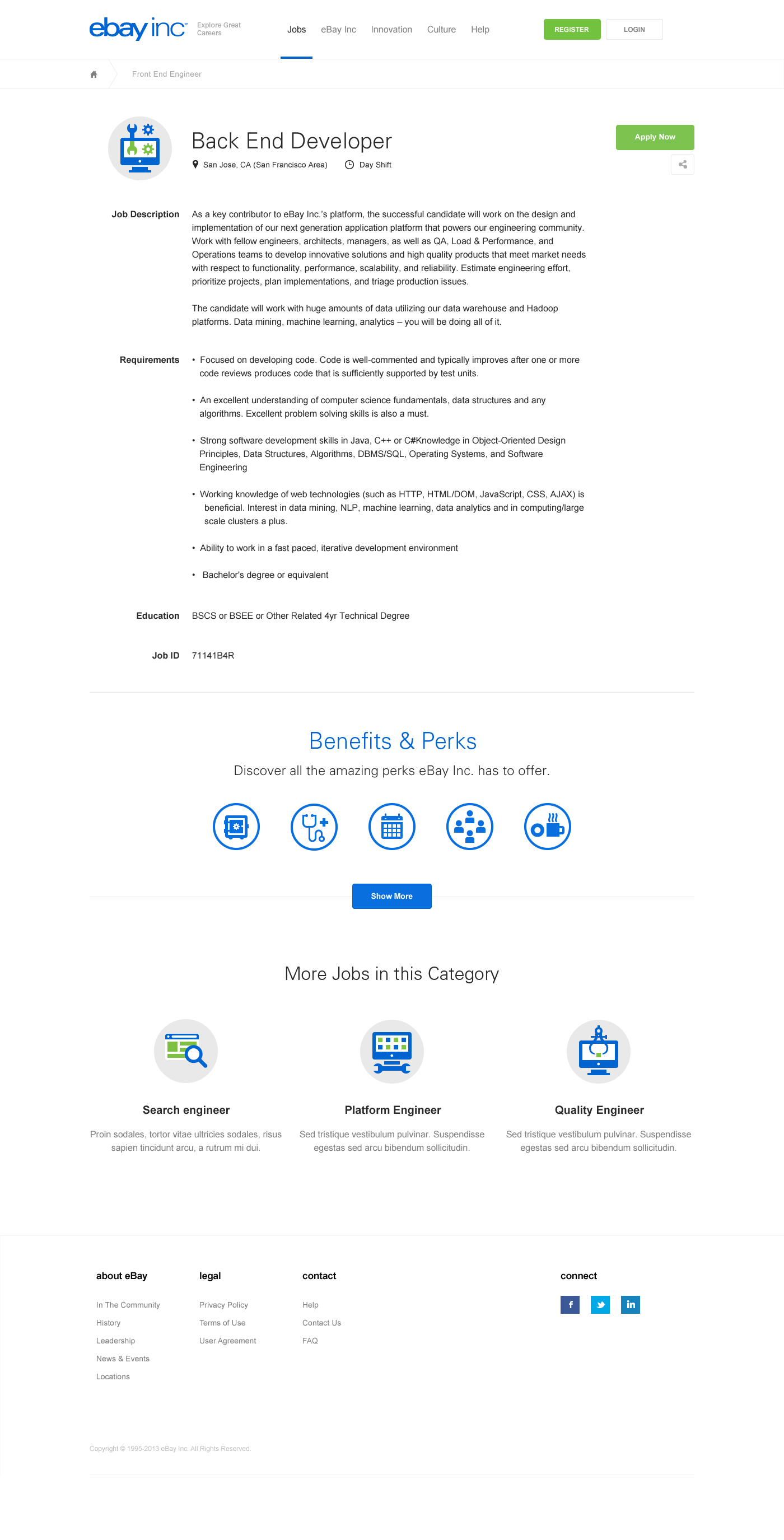
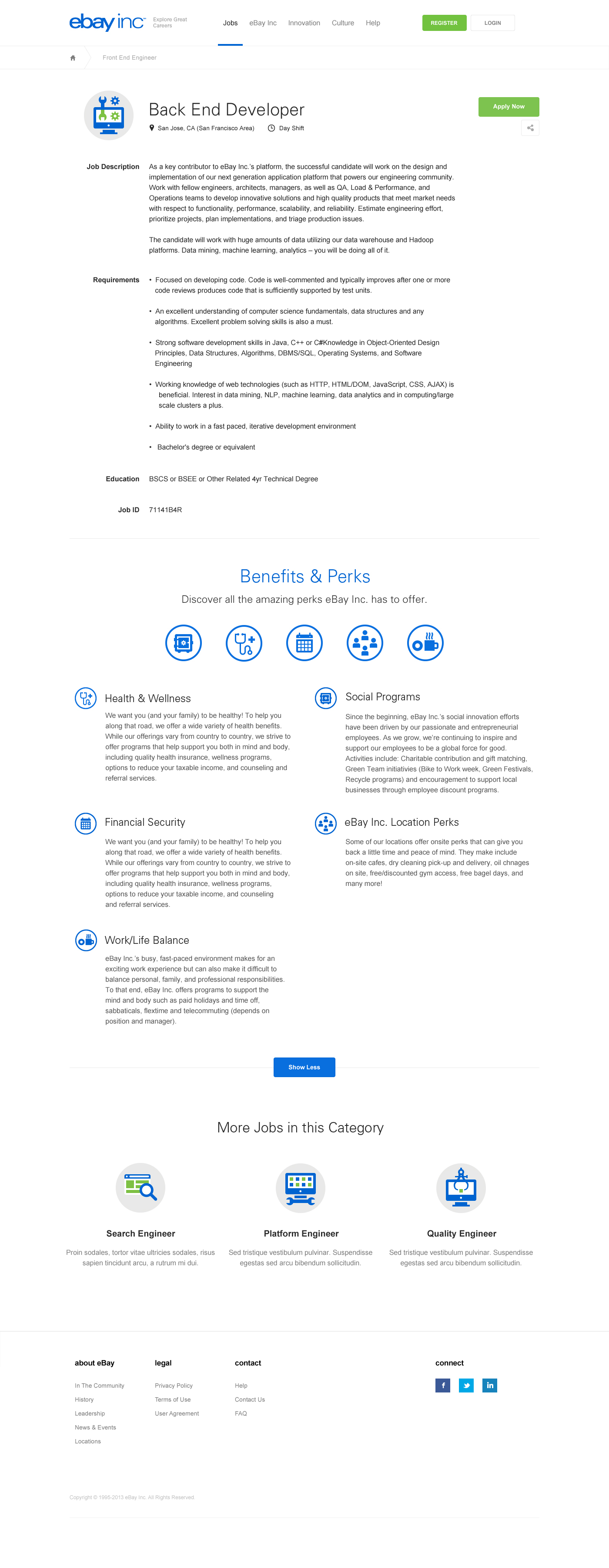
Job Details Page
After browsing through the jobs, the candidate selects one and enters the Job Details page. This page made a tremendous leap forward in terms of visual appeal and user engagement, accomplished by making perks an expandable icon-based module and bringing related jobs up on the page so users don't need to scroll so far or hunt around for other positions that may be of interest.
Apply: New User + Quick Apply
Applying for a job brings the user into the registration flow. If the candidate has an application on file already, they are shown the "Quick Apply" option to help speed things along.


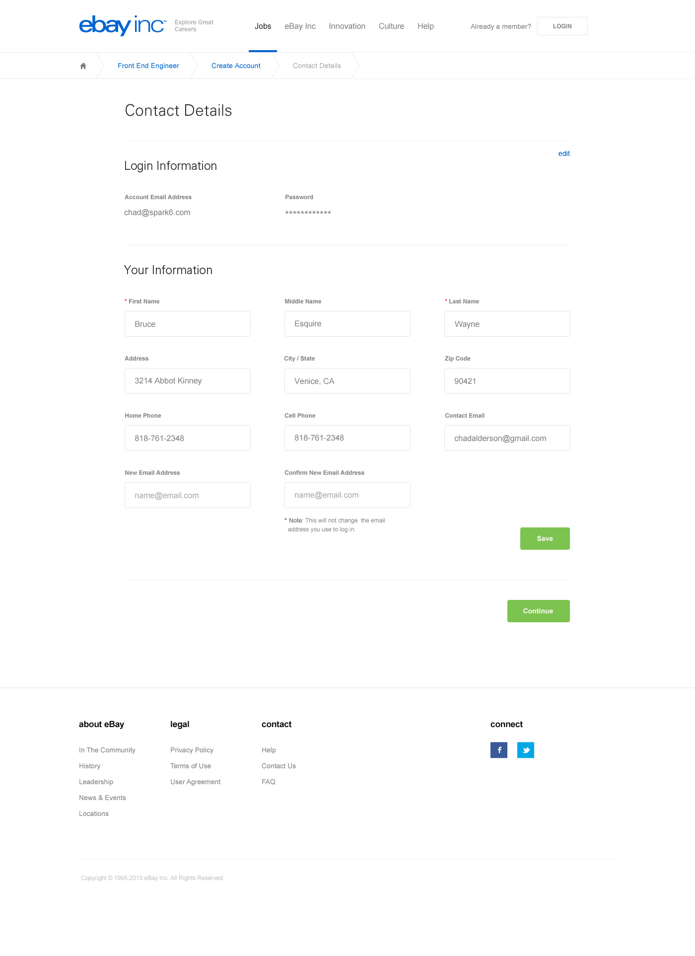
Creating your resume
Candidates fill out contact details first, then move on to the Resume page—this gives the system time to pull information from LinkedIn if available as well as ensuring the user has a functional account even if they abandon the application mid-stream. The Resume page offers LinkedIn API connection and data gathering.


Preview & Submit
Before finalizing the candidate's application, the user is presented with a preview of the document they have created.

Congratulations!
After submission, a friendly page including a mock employee badge with the user's LinkedIn profile image (if available) is presented. The page includes an immediate call to action: to apply for another role, suggested based on similarity and application status. The page also affords connecting to LinkedIn or adding a password to their email-based account (account merging).


My Account
The user account page offers a simple interface to handle a complex problem: unifying the two sign-in methods by allowing LinkedIn users to add a password for signing in with an email address, and encouraging users without LinkedIn connectivity to easily enable the feature.


Outcome
The site is still in development, but the interaction paradigms and UX upgrades were extremely well-received by the user testers we chatted with during the course of the project. All of the users we asked about the new application flow were impressed and satisfied by the clean simplicity of the layout and save-as-you-go editing model.
This project was done during my tenure with Spark6, a leading agency for end-to-end experience design. I created the site wireframes and interaction design, handled information architecture and content strategy, and consulted as design progressed to ensure the user experience remained true to the original ideas. We worked with an icon designer to create the custom set of icons for this project, and the client was very satisfied.
User Experience
- Outstanding UEX throughout – including application flow
- Excellent, smart search & browse experience (so jobs are easy to find)
Innovation throughout
- How can we be different from other recruiting sites?
- How do we bring our products and company to life in a tangible way?
- How do we make the site feel personable / human?
Legal
- Compliance with all necessary legal requirements